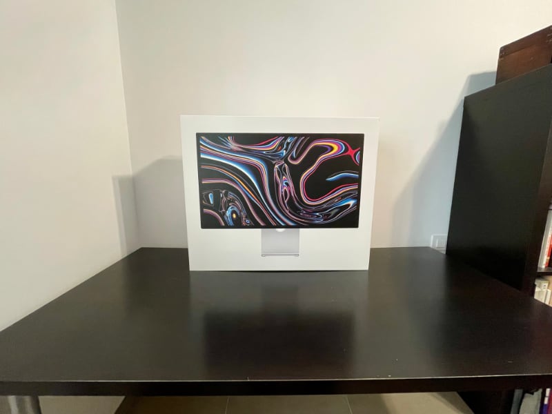
I didn't return my Apple Studio Display
The Apple Studio Display is, unquestionably, a very good monitor.
But the real question is, should you pay €1,800+ for it?
I have been asking that question myself for the past ten days.
Today I decided that while I can't recommend it, I will not return my new monitor. Here's why.
The Pros
I replaced my Benq 27" 2560x1440 IPS LCD display with the Studio Display. These are the main benefits:
The panel. It is good. It could be better, of course. It could have more modern features, too. But it is a good 5k retina panel.
As soon as I started using the Studio Monitor it felt like I had put glasses on. Every other screen looks blurry now.
The rest of the review is accessory to this experience. It is something that you have to, quite literally, see with your own eyes.
The speakers and microphone. They are fantastic. A big step up from any other speakers I've used on any computer.
True Tone. All other displays look bluish now. Great underrated feature.
It is the best-in-class. Simple as that. Its only competitor is the LG UltraFine, which is not much cheaper and lacks other features. If you want a 5K retina display the Studio Display is the best choice.
The Cons
Like everything with recent Apple, there is no progress without compromise.
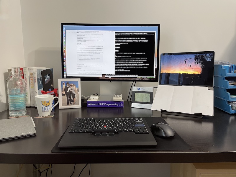
The stand is too low. Asking users to pay an extra €460 for an adjustable stand is an insult. Sorry but there is no other way to put it. Therefore, this beautiful piece of hardware now stands on top of an ugly PHP reference manual.
Apple, if you ship a monitor with a non-adjustable stand in 2022, please make sure that the default height is at an ergonomic level. It should be at least 5-8 centimeters higher. Since Apple is the company which cares the most about accessibility, no sarcasm here, we can only conclude that this was either a punitive or aesthetic decision.
The screen. It is glossy like all Apple displays. For me this is the first glossy display I've used, so it stands out.
I now notice distracting reflections when working with a dark app. I would have liked to test the nano-textured glass, but I am not going to pay an extra €250 on top of the €1,800.
The speakers. They have too much bass. All audio is artificially deep. For music this is not an issue, but for video conferences it makes every person sound like James Earl Jones.
Clearly Apple never tested for this use case, because they hate video conference users as we will see below.
It doesn't bother me too much, but I wonder why the speakers couldn't sound more natural. It is not a defect of the hardware. Somebody made an odd decision.
The Don't Cares
High brightness. 600 nits is really bright indoors, but if you need such a high brightness level it means you have other problems. If you are in an extremely lit room, maybe with direct sunlight, the reflections will overpower the display brightness.
Good feature, but unlike on a laptop, it doesn't make a difference.
USB-C hub. If you use an Apple laptop you need an external Thunderbolt dock anyway.
I still have six devices which require USB-A and only one which requires USB-C. Therefore, they are plugged to my dock. The extra USB-C ports on the Display remain unused.
It is a nice feature, don't get me wrong, but in 2022 we are not yet in a world where you can ignore USB-A. That is the truth, even if Apple doesn't like it. I know I am asking for an impossible, but if they wanted to make the USB hub useful, they should have included USB-A ports on this monitor.
Non-detachable power cable. I guess it should be user replaceable, but I've never, in my 30 years using computers, have a monitor power cable fail me. It's a non-issue.
That said, mark my words, I hope I don't have to eat my hat in three years.
No buttons or controls. I guess this is a good feature and it does make the display more beautiful, but I really don't care. Hey, this is my review!
The Cruelty
There is a product manager at Apple who, for some reason, hates webcam users with a burning passion.
They despise them so much that they wish they could personally slap each and every webcam user in their ugly, vassal faces.
Since that is physically impossible, they decided to incarnate that slap into the worst webcam Apple has ever shipped.
I compared the 2020 Macbook camera to the 640x480 VGA camera of my 2006 Nokia 5200. Believe it or not, this webcam is worse.
Apple picked up the worst lens SKU they had in stock and hopefully due to a bug they decreased the quality of the image processing pipeline. And this is on an expensive monitor with plenty of physical space to fit a big, quality lens.
WHY, APPLE, WHY?
Gruber found the perfect adjective: cadaveric.
I kid you not, the first call I did with my new monitor, the colleague at the other end, who sees me every day, asked me if I was sick.
For the love of all that's good, Apple, if your webcam can be even slightly fixed with software, please do it.
The Veredict
I was not only ready, I was eager to return this monitor.
I had been keeping some notes where I was compiling my thoughts to help me make a decision.
At the bottom I wrote down what I would do with the return money. "Surprise my wife with an expensive vacation". "Buy new water heater". "Get an electric bike". "Buy two 4K monitors".
But I knew that, below all layers of cynicism and anger, I had to be fair and make a rational decision.
Before putting the monitor back in its box, I asked myself the questions that really matter when making a purchase decision.
- Improvement: Is this monitor better than my current one? YES
- Value: Can I get a better one for that same price? NO
And I did something else: I plugged the Benq back and used it for ten minutes.
Nope.
- Need: Am I willing to go back to my 27" Benq? NO
It's either this or glasses
Once you try the Studio Display every other monitor makes you feel like you need glasses —Apple, feel free to use this benefit in your marketing copy.
I'm approaching 40 and I am starting to realize that my sight is deteriorating a bit. I can see very well, but I find it more difficult to read small text at a distance.
The Studio Display fixes that. I do not need to increase font size anymore. The text rendering is so good that I can continue reading 12pt websites at an arm's distance.
Had I not used it for ten days, my frame of reference would be the same, and I would not "miss" a feature I didn't know existed. I would be happy with my Benq, increasing font size when needed, adjusting to my diminished visual abilities.
Wait, I know what you're thinking. You could have shown me this article ten years ago and I would've dismissed it. "Old people problems", I would've said, "an exaggeration".
But I can't go back. Apple pundits often say that "Apple ruined them with Retina", and I understand it now. It is something you have to experience.
Apple, why do you make this so difficult?
Of course the price tag is expensive. But it's not about the money, it's Apple's bizarre design decisions.
I can understand a compromised monitor for €900. But I can't understand a compromised one for €1,800.
Therefore, my recommendation for you as a reader is that you do not buy it, unless:
- Money is no issue, you only go for quality, not value. In that case, get the adjustable stand too, and maybe the nano-textured glass.
- You really do need a retina screen because you are starting to notice blurry pixels on regular monitors.
Marques puts it very well. The Apple Studio Display is not a good deal.
Unfortunately, it is the only deal.
As for me, there is no salvation. I am ruined by Retina.
You win again, Apple.
I just wish you didn't make every new product a battle. Please, let me buy a product and be happy afterwards without reservations.
Here it is, on top of the ugly PHP book. This setup will remind me every day for the next ten years that an Apple PM decided that not suffering from neck pain should be an €460 upsell.

