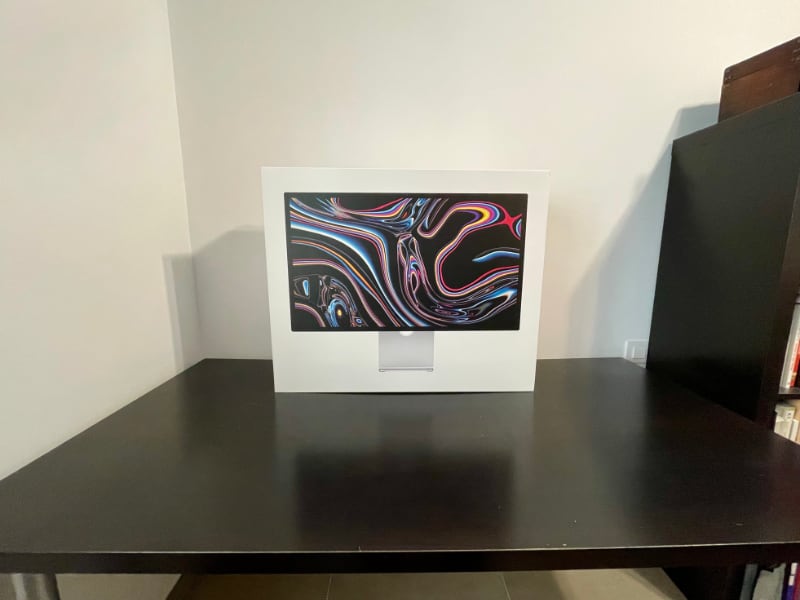
I didn't return my Apple Studio Display
The Apple Studio Display is, unquestionably, a very good monitor.
But the real question is, should you pay €1,800+ for it?
I have been asking that question myself for the past ten days.
Today I decided that while I can't recommend it, I will not return my new monitor. Here's why.
The Pros
I replaced my Benq 27" 2560x1440 IPS LCD display with the Studio Display. These are the main benefits:
The panel. It is good. It could be better, of course. It could have more modern features, too. But it is a good 5k retina panel.
As soon as I started using the Studio Monitor it felt like I had put glasses on. Every other screen looks blurry now.
The rest of the review is accessory to this experience. It is something that you have to, quite literally, see with your own eyes.
The speakers and microphone. They are fantastic. A big step up from any other speakers I've used on any computer.
True Tone. All other displays look bluish now. Great underrated feature.
It is the best-in-class. Simple as that. Its only competitor is the LG UltraFine, which is not much cheaper and lacks other features. If you want a 5K retina display the Studio Display is the best choice.
The Cons
Like everything with recent Apple, there is no progress without compromise.
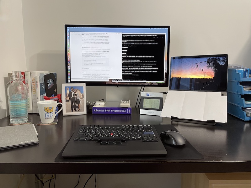
The stand is too low. Asking users to pay an extra €460 for an adjustable stand is an insult. Sorry but there is no other way to put it. Therefore, this beautiful piece of hardware now stands on top of an ugly PHP reference manual.
Apple, if you ship a monitor with a non-adjustable stand in 2022, please make sure that the default height is at an ergonomic level. It should be at least 5-8 centimeters higher. Since Apple is the company which cares the most about accessibility, no sarcasm here, we can only conclude that this was either a punitive or aesthetic decision.
The screen. It is glossy like all Apple displays. For me this is the first glossy display I've used, so it stands out.
I now notice distracting reflections when working with a dark app. I would have liked to test the nano-textured glass, but I am not going to pay an extra €250 on top of the €1,800.
The speakers. They have too much bass. All audio is artificially deep. For music this is not an issue, but for video conferences it makes every person sound like James Earl Jones.
Clearly Apple never tested for this use case, because they hate video conference users as we will see below.
It doesn't bother me too much, but I wonder why the speakers couldn't sound more natural. It is not a defect of the hardware. Somebody made an odd decision.
The Don't Cares
High brightness. 600 nits is really bright indoors, but if you need such a high brightness level it means you have other problems. If you are in an extremely lit room, maybe with direct sunlight, the reflections will overpower the display brightness.
Good feature, but unlike on a laptop, it doesn't make a difference.
USB-C hub. If you use an Apple laptop you need an external Thunderbolt dock anyway.
I still have six devices which require USB-A and only one which requires USB-C. Therefore, they are plugged to my dock. The extra USB-C ports on the Display remain unused.
It is a nice feature, don't get me wrong, but in 2022 we are not yet in a world where you can ignore USB-A. That is the truth, even if Apple doesn't like it. I know I am asking for an impossible, but if they wanted to make the USB hub useful, they should have included USB-A ports on this monitor.
Non-detachable power cable. I guess it should be user replaceable, but I've never, in my 30 years using computers, have a monitor power cable fail me. It's a non-issue.
That said, mark my words, I hope I don't have to eat my hat in three years.
No buttons or controls. I guess this is a good feature and it does make the display more beautiful, but I really don't care. Hey, this is my review!
The Cruelty
There is a product manager at Apple who, for some reason, hates webcam users with a burning passion.
They despise them so much that they wish they could personally slap each and every webcam user in their ugly, vassal faces.
Since that is physically impossible, they decided to incarnate that slap into the worst webcam Apple has ever shipped.
I compared the 2020 Macbook camera to the 640x480 VGA camera of my 2006 Nokia 5200. Believe it or not, this webcam is worse.
Apple picked up the worst lens SKU they had in stock and hopefully due to a bug they decreased the quality of the image processing pipeline. And this is on an expensive monitor with plenty of physical space to fit a big, quality lens.
WHY, APPLE, WHY?
Gruber found the perfect adjective: cadaveric.
I kid you not, the first call I did with my new monitor, the colleague at the other end, who sees me every day, asked me if I was sick.
For the love of all that's good, Apple, if your webcam can be even slightly fixed with software, please do it.
The Veredict
I was not only ready, I was eager to return this monitor.
I had been keeping some notes where I was compiling my thoughts to help me make a decision.
At the bottom I wrote down what I would do with the return money. "Surprise my wife with an expensive vacation". "Buy new water heater". "Get an electric bike". "Buy two 4K monitors".
But I knew that, below all layers of cynicism and anger, I had to be fair and make a rational decision.
Before putting the monitor back in its box, I asked myself the questions that really matter when making a purchase decision.
- Improvement: Is this monitor better than my current one? YES
- Value: Can I get a better one for that same price? NO
And I did something else: I plugged the Benq back and used it for ten minutes.
Nope.
- Need: Am I willing to go back to my 27" Benq? NO
It's either this or glasses
Once you try the Studio Display every other monitor makes you feel like you need glasses —Apple, feel free to use this benefit in your marketing copy.
I'm approaching 40 and I am starting to realize that my sight is deteriorating a bit. I can see very well, but I find it more difficult to read small text at a distance.
The Studio Display fixes that. I do not need to increase font size anymore. The text rendering is so good that I can continue reading 12pt websites at an arm's distance.
Had I not used it for ten days, my frame of reference would be the same, and I would not "miss" a feature I didn't know existed. I would be happy with my Benq, increasing font size when needed, adjusting to my diminished visual abilities.
Wait, I know what you're thinking. You could have shown me this article ten years ago and I would've dismissed it. "Old people problems", I would've said, "an exaggeration".
But I can't go back. Apple pundits often say that "Apple ruined them with Retina", and I understand it now. It is something you have to experience.
Apple, why do you make this so difficult?
Of course the price tag is expensive. But it's not about the money, it's Apple's bizarre design decisions.
I can understand a compromised monitor for €900. But I can't understand a compromised one for €1,800.
Therefore, my recommendation for you as a reader is that you do not buy it, unless:
- Money is no issue, you only go for quality, not value. In that case, get the adjustable stand too, and maybe the nano-textured glass.
- You really do need a retina screen because you are starting to notice blurry pixels on regular monitors.
Marques puts it very well. The Apple Studio Display is not a good deal.
Unfortunately, it is the only deal.
As for me, there is no salvation. I am ruined by Retina.
You win again, Apple.
I just wish you didn't make every new product a battle. Please, let me buy a product and be happy afterwards without reservations.
Here it is, on top of the ugly PHP book. This setup will remind me every day for the next ten years that an Apple PM decided that not suffering from neck pain should be an €460 upsell.
Quantum computing keeps advancing, and it looks spectacular
About a month ago IBM introduced the Eagle, its first 127-qubit quantum computer.
And it's breathtaking, both on the inside...
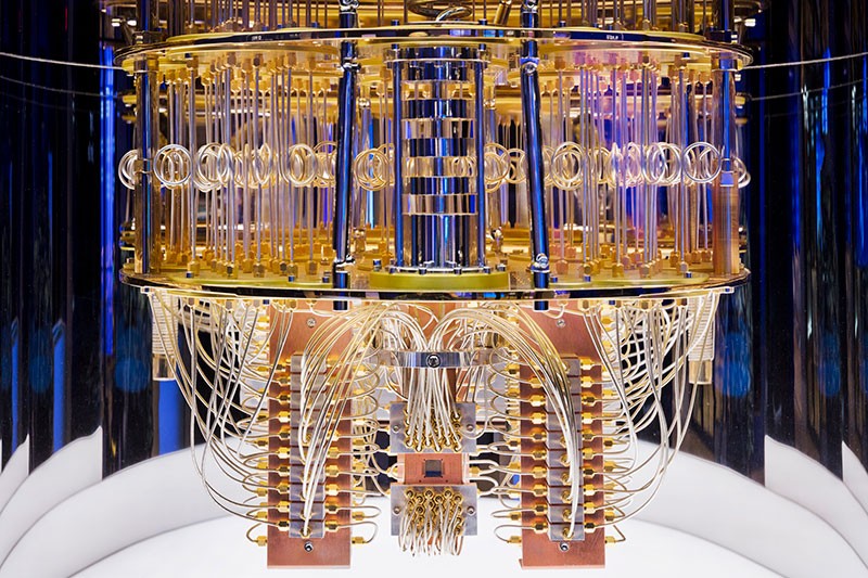
... and the outside
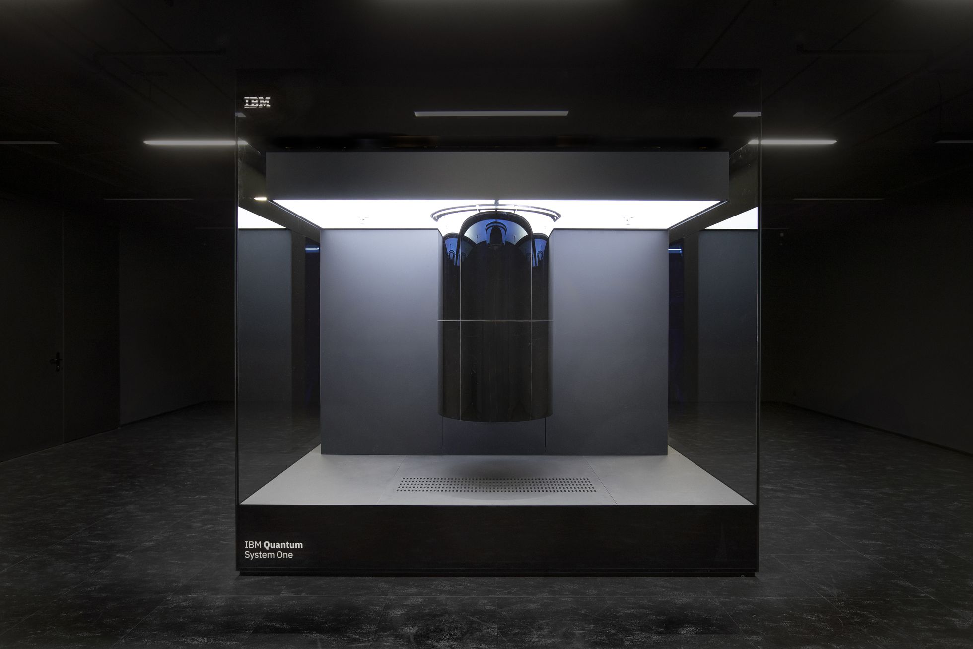
Interestingly, this is not just frivolous design. Besides the futuristic looks, quantum computers require some very peculiar architectural designs.
What makes quantum computers special
Regular computers like the one you're using right now store data in bits. You know, zeros and ones. Bits are electric signals transmitted between electronic components, like transistors.
Quantum computers also use the binary system, but they store data on a different medium. They use particles such as electrons or photons, or superconductor cable loops.
These materials are chosen because they have two quantum features which are required, well, to make quantum computers work.
1. Superposition, or the ability to store different status at the same time. Two bits allow the storage of a small number between zero and four. Two qubits allow the storage of four simultaneous numbers. That's four times as much information.
2. Entanglement, or sharing "data" between qubits. Regular bits are independent, but the status of one qubit can influence another qubit.
Interesting applications
The math and physics are complex, but in summary, quantum computers can handle a huge amount of data. They make current supercomputers look like pocket calculators.
That makes them especially useful to solve problems which can only be solved by testing multiple combinations of numbers. For example, drug discovery, cryptography, planning and routing, weather forecast, etc.
You may realize that those are the same problems where we are applying Artificial Intelligence nowadays. That's no coincidence. AI is a technique to solve complex problems with a bit of intelligence, while quantum computers can bruteforce the solution. And both methods can be useful and complementary depending on the situation.
Quantum is the future, but not the present
While the technology is still immature, scientists are preparing for a world with widespread quantum computing capabilities.
In this world, traditional computing will become obsolete, a lot of problems will need to be reassessed, and others will appear.
Who knows? Maybe in thirty years you will be reading my blog on a quantum cellphone... or whatever it is we will use then.
If you want to learn more, I recommend this article in Nature, this introduction to quantum computing in NewScientist and the very enjoyable TV drama about quantum computers Devs
Adapted from my Twitter thread
No notebook is perfect, but the reMarkable comes really close
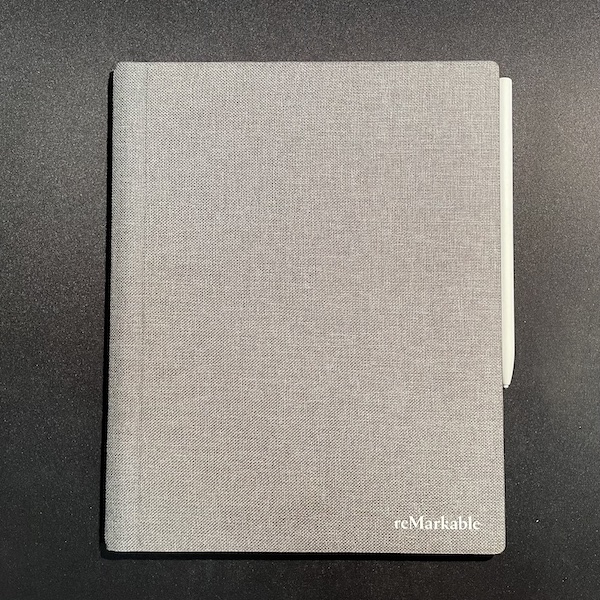
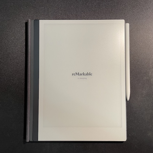
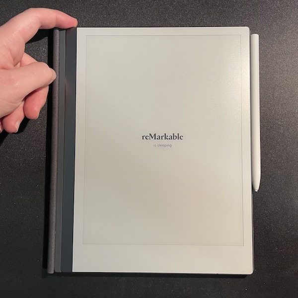
The reMarkable is a premium e-ink notebook. Imagine a Kindle, but you can write on it.
It has become my daily notebook. I take all my meeting notes on it, dump my ideas and designs, and carry it with me everywhere. As a bonus, it also has replaced my Kindle and my relationship with ebooks and "read it later" in general.
I have been using a reMarkable for six months. It is a great product, but the 500€ price point is probably double than most people would be willing to pay for.
This article aims to answer one single question: should you buy one, and pay more than an iPad, which has more features?
The price tag and the 30-day return window
The reMarkable store gives you 30 days to return it if you're not satisfied. Were it not for this option, I would have never bought one.
During my first weeks of use I couldn't stop considering returning it. To organize my thoughts I created a note on the reMarkable where I dumped my raw impressions.
On top, with big letters: "Should I return it?". Below that, random thoughts. "I enjoy it. Magical things happen when you write on it". "557€". "Pen feeling is ok very good". "Don't think of the money". "Disappointed with the OCR". "Good for reading but not great"
When approaching the end of the return period I asked myself, "if this product cost 200€, would I return it?". Definitely not. "Do I enjoy my interactions with the reMarkable, even if it's not perfect?". Definitely yes.
So I opened my thoughts note, and at the bottom, with fancy calligraphy, I wrote: "I'll keep it!"
Six months later, and with the price tag long forgotten, I'm glad I did.
The reMarkable as a notebook
👍🏼 On the plus side:
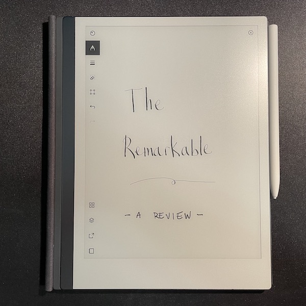
The writing experience is excellent. This is indeed the most critical aspect of the product. The reMarkable is a fantastic notebook.
It does really seem like you are using pen and paper. There is almost no lag when writing, the text is crisp, and the texture of the screen is even better than those of a Wacom.
Perfect size. Big enough to write long lines and diagrams and have plenty of space, yet a bit smaller than an A4 which makes it fit everywhere.
The pen tips last long enough. I had the feeling that I would need to replace them too often, but that's not the case. My first tip has lasted for 6 months of daily use.
The filesystem and document management is simple and works well. Syncing cloud stuff is a difficult task and I was somewhat afraid that it would be unreliable. It works well and any time that the sync failed I've been able to retry and make it work.
In general, the reMarkable software does not do a lot, but what it does, it does well.
You can use it as a whiteboard with your computer. I had a Wacom but the reMarkable retired it. It can "project" your current page to the reMarkable app on your computer. You cannot use the pen as an input device directly, but this compromise works well when you are doing e.g. a video conference and want to draw something and share it with colleagues.
It is distraction free. If you buy an iPad you get more features, but you will be tempted with distractions when you are working. An iPad replaces a computer. The reMarkable replaces a notebook.
It really does make you more creative. The fact that you can easily erase and move elements on the page and work with layers allows you for a more creative thought process. You are not constrained by a permanent pen on paper or having to erase and rewrite with a pencil. I am regularly sketching new ideas and designs much quicker and easier than with a regular notebook, a blackboard or a computer.
You can bring it to interactions where using an iPad would be rude. Because it is so clearly a notebook and not a computer you can use it in places where it would be rude to pull out a phone, iPad or a laptop.
As an example, I recommended the reMarkable to a friend of mine who is a psychologist, and they use it when talking to patients. I bring it to very important meetings where having a "computer" on the table could suggest a lack of attention or respect to the other party.
Writing on the reMarkable. Note the quick response to the pen and the audio of the writing experience.
👎🏼 However, the reMarkable as a notebook has one big drawback and some minor aspects to improve.
The OCR is useless. This is the most disappointing aspect of the reMarkable. Yes, it has OCR and it is of acceptable quality, but it doesn't work the way it should.
On the reMarkable, OCR needs to be invoked manually and the output text is then sent by email as a plain txt file. If you were hoping for it to work like ocrmypdf you will be disappointed.
To be useful, OCR ought to happen automatically, and should keep the converted text linked to the page graffitti as a reference. If that is too complex, at least add the recognized text as metadata so that the handwritten notes can be searched.
One of my main time sinks is to tidy up my handwritten meeting minutes into a computer document. I was hoping that my reMarkable would solve that and I only had to edit the OCR errors, but that was not the case. I still have to manually type my notes to a document afterwards.
Not having searchable notes was almost a deal-breaker for me, and I still have hope that this behavior will be implemented in the future as an update.
The eraser tool could be much improved. You can either select an area to delete or drag the pen and delete areas below it, but you cannot delete strikes.
Syncing should be more proactive. To sync your changes, you need to (1) close the current document, (2) wait for the reMarkable to connect to wifi, (3) wait for the sync to finish.
This means that the opened document you are working on will not sync unless you close it. I understand this is done to save battery, but I feel like the reMarkable should still wake up the radio and sync the current document every 15 minutes or so.
The accessories are expensive. You must use a pen with the reMarkable. It should be included in the base package, and the only reason it isn't is to reduce the price tag on the homepage. That feels a bit dishonest. The comparison with the iPad doesn't hold, because the iPad is not a notebook. Therefore, the base price of the reMarkable is $450.
The pen with the eraser is unreasonably priced and nobody should buy it since the eraser is no good anyways.
Regarding the cover, it is more necessary than on other tablets, because you can't risk damaging or even slightly scratching the soft screen. The sleeve is $70 and the book-like cover is $120.
This sets the real price of a reMarkable between $520 and $670.
The reMarkable as an ebook reader
The reMarkable is a fine ebook reader which supports both pdf and epub files. It has no backlight, but I don't find that an issue as I don't read in bed.
Transferring and organizing files is super easy and much more convenient than on a Kindle or iPad. The desktop or mobile app allows you to send any document to the cloud, which will quickly sync to the reMarkable.
I have made a habit of exporting interesting articles or even long emails to pdf and sending them to the reMarkable. It is my "read it later". After many years of struggling with a good solution for this use case, I am very happy with the result.
The size is definitely on the larger side if you are used to smaller Kindles, but it has its benefits, especially when reading PDF files.
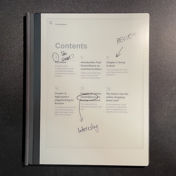
If you are familiar with dedicated ebook readers, you will miss a dictionary, bookmarks and annotations. You can highlight parts of the text, but there is no index of annotations anywhere. This makes it unsuitable for some types of editing and annotated reading.
Finally, in case somebody from reMarkable reads this, please fix your gesture to turn pages. I find myself needing to do the gesture up to four or five times until it works. This is a bit annoying when writing, but very prominent when reading ebooks. I would appreciate a setting or a mode where you can turn pages just by tapping on the margins, like other ebook readers.
Other thoughts
The battery life is excellent. You do not need to worry about it. It lasts between one and two weeks. Remember to use the sleep button for a better battery experience.
You have root access. The reMarkable is a proud Linux computer and you can SSH into it. You can install third party software. However, that software is not very polished, and sometimes even experimental, so I ended up using the official apps. Just be aware that if you're felling brave you can install other notebook apps and ebook readers, some games, new templates, and even make the pen a real input device for your computer.
They are moving towards a subscription model. After reading about it, in my opinion, you don't need the subscription. Google Drive and Dropbox integration are not necessary because the provided cloud service works well. The handwriting conversion is moot as explained above. Screen share is nice to have but it's one of those use-once-or-twice-every-year things. If you choose to pay for the subscription you get a discount on the device, so both options are good.
The option to connect an external keyboard would be killer. Of course, the main use case is to write with a pen. However, given that this is a distraction-free device, the option to behave essentially like the screen of a typewriter would be much appreciated by writers and minimalists.
The magnetic snap of the pen is very addictive
Should I buy it?
The reMarkable is a brilliant device that will replace your paper notebook and, unless you are an advanced user of ebook devices, your ebook reader. It is the ideal companion to a laptop.
Having a reMarkable at hand makes you more creative and you will want to carry it everywhere. The experience of writing on the reMarkable is far superior to pen and paper and even iPad-like tablets. It provides a distraction-free environment with a much better handwriting experience.
It is very easy to upload and download data from it and you will find yourself sending longer articles to the reMarkable to read later. However, it will not solve the problem of typing up handwritten notes on a clean computer document.
The price tag is very high, but there is a 30-day return guarantee, and you will really enjoy using this device.
Update: November 2023
I wrote this article in November of 2021, which means I've been using my reMarkable for about 1,000 days.
It's a great conversation starter. When people see me using it, they seem to recognize it from online ads and ask if they can try it by themselves. I indulge them, of course. Without exception, their mind is blown: this feels like paper, they say. It does.
Inevitably, when they ask whether they should buy it because it's so expensive, I always answer the following: if mine broke, I'd buy another one instantly. Therefore, if you can afford it, it is a great investment. 1,000 days later, many other e-ink notebooks have appeared, and none beats the reMarkable at being a notebook.
The M1 Macbook Air, one year later
This article is part of a series:
Ah, the life of a regular user. All the cool youtubers are rushing to publish their reviews of the new and shiny Macbooks Pro, and here I am with my review of the year-old M1 Macbook Air.
(If you want to watch some great MBP reviews, I recommend the ones from Lisa and Dave)
Since I'm not a reviewer, I'm going to do something unusual and probably more interesting.
I am going to compare the 2020 Air with the 2013 Air as it was released.
2020 vs 2013
The TL;DR is that the 2020 is a 9.5/10 but the 2013 was a 10/10. I was in love with that machine since day one until the day I retired it.
Of course, any nitpicks I will mention don't really matter and they are outshined by the fact that it's a fantastic machine and there is no other consumer laptop that comes close.
Let's start with the things where the 2020 is better than the 2013:
- Mind blowing battery life under normal and low use. You can easily get 14-16 hours when web browsing, writing or streaming. The 2013 used to get 10-12 with low use, and 5-7 with regular use, but this is incredible.
- Great battery life under moderate load, about 7-10 hours. The 2013 suffered when the CPU was stressed and dropped to 3-4 hours.
- The Retina screen is really nothing out of the ordinary nowadays, but it shines when compared to the TN panel that the 2013 had.
- The speakers are incredible for a laptop this size. The 2013's were not bad for the time, but these are much better.
Now, some aspects where both machines are equivalent:
- The SSD is quite fast, applications launch quickly, the system is very responsive
- The webcam is acceptable
- The keyboard and trackpad are both great
- The version of macOS included on release was a bit buggy but it improved with the following release
- The 2020's form factor is nice and compact, and the 2013's also was when compared to contemporary laptops
And finally, a few issues which are unique of the 2020:
- The battery is degrading at the speed of light. After only 56 cycles the health is at 85%. My usage pattern is similar to the one I had with the 2013, and it took four years before I had to replace it.
- Speaking of which, it has a non-user-serviceable battery or SSD. I had to swap both on my 2013 and I dread the moment this laptop completely dies because of SSD degradation.
- The port selection sucks and it took me 4 tries to get a good USB/Thunderbolt dock
- Speaking of which, the headphone jack is on the wrong side
- External monitor EDID management is buggy and many LCDs look blurry. The 2013 had no issues with this.
- External USB drives behave erratically. Sometimes they mount and unmount instantly, other times they take multiple minutes to mount/unmount
- Emulation of Windows systems is in a bad state. I have multiple Virtualbox images which replicate older computers I used when I was a kid, for nostalgia reasons, and they stopped working.
Overall, some of these items are related to the Apple Silicon, others are related to the form factor, and others to software. It doesn't matter. The experience is perfect but not flawless.
I am, however, very hopeful for the future, so I don't really mind.
What about Pro users?
From my analysis of the 2016 Macbooks Pro:
[Apple] Ask your own engineers which kind of machine they'd like to develop on. Keep making gorgeous Starbucks ornaments if you wish, but clearly split the product lines and the marketing message so all consumers feel included.
The 2020 Macbook Air is clearly a consumer laptop, and the 2021 Macbooks Pro are undoubtably a Pro laptop. We are back to the famous four-product matrix.
That is probably the most important aspect of the Great Contrition that Apple is going through, and not many Apple pundits have talked about it.
The fact that consumers can buy a great laptop for 1000€ is fantastic. But even better is that Pro users now have the option to spend a lot of money on a machine which is leaps, not steps, ahead of the consumer one.
Speaking of price:
Many iOS apps are developed outside the US and the current price point for your machines is too high for the rest of the world. I know we pay for taxes, but even when accounting for that, a bag of chips, an apartment, or a bike doesn't cost the same in Manhattan than in Barcelona
Non-US salaries make it a bit difficult to justify the expenditure on a 2021 Pro laptop, but anybody can develop iOS apps on a sub-1500€ Apple computer.
Finally, a laptop I can recommend
I can safely recommend the 2020 Air to any non-technical person who asks me which laptop they should get. More importantly, I am now confident that the next 10 years of Apple hardware will not disappoint me. I will not need to keep fumbling with Linux laptops unless for fun.
Furthermore, for price-sensitive Pro users, the Air is still probably the best bang for your buck.
Honestly, I really don't know if I consider myself a "Pro" anymore. I am a power user but I definitely don't need superfast CPUs, tons of RAM, pixel-perfect screens or eardrum-breaking speakers.
But boy, am I glad that users who need those finally can have them. This one is for you, congratulations!
The story ends here. Did you read all previous chapters?
How I moved my setup from a Mac to a Linux laptop
This article is part of a series:
Returning the Macbook Pro
In the previous installment of this series I explained how I had been disenchanted with recent Macs.
The fact is that shortly after writing that review I returned the 2020 Macbook Pro.
I tried to love it, honest to God, but it was mediocre.
Let me share with you the list of issues I found while using it for two weeks:
- USB2 keyboard and mouse randomly disconnecting. I tried 3 different USB/Thunderbolt adapters, including Apple's, to no avail.
- Abnormal rattling sound when fans start spinning, as if they were not properly seated.
- Not detecting the internal keyboard sometimes after resuming sleep.
- Only 5 hours of battery life when streaming video with the screen off, connected to a TV.
- Battery drained from 70% to 15% after sleeping overnight.
- The touchbar. I spent time trying to make it useful with BetterTouchTool. Then I discovered that the keypresses don't register correctly most of the times, and I had to tap twice or three times, which defeats the purpose of having a dedicated shortcut.
- Trackpad registers too many spurious taps and the cursor jumps around the screen while typing.
- Airpods Pro have ~400ms of audio lag when watching videos. Solved with a reboot but it appears again after a few minutes.
The fact that it had issues with the internal keyboard and the USB subsystem made me think that the unit may have a faulty logic board. I discovered later, through a Reddit thread, that the USB2 issue was not specific to my unit, but it didn't matter much.
I was feeling really ripped off with a machine I had spent 2.000€ on and which, speed aside, was worse than my 2013 Air in every way I cared.
In the end, my gut told my brain, "Stop rationalizing it, this laptop makes you unhappy", and I came to terms with it.
Now what?
I had been dreading this moment since 2016, when I realized that Apple didn't care about my demographic anymore.
Migrating platforms is a big hassle, so after I made the decision to return the Macbook Pro, I thought carefully what the next steps would be.
In order to transition from the Mac to Linux I had to prepare a plan for for new hardware, new software, and a new cloud ecosystem.
At that point there were strong rumors about ARM Macs. I thought I'd use Linux for an indeterminate amount of time, until Apple hopefully released a good Mac again. Which may have been "never", though I was optimistic.
I have used Linux extensively in my life, since 1999, but mostly as a developer. Nowadays my requirements are more "mainstream" and I need apps like Microsoft Office and Adobe Reader to do my job. This is an important point to make. This computer is my main work tool, and it needs to accommodate my own needs as well as my job's. I spent some time making sure that I could run all the software I needed. As a last resort, there is always the option of using a VM.
As a final step, I had to move all the iCloud stuff out of there, because it is not interoperable with standard clients. I decided I would self-host it and see how difficult it is to leave the walled garden.
Therefore, I needed to fulfil the following requirements:
- Good laptop hardware with Linux support
- Ability to run work-related software
- Self-hosted (or almost) cloud services
1. Choosing a new laptop: The 2018 Dell XPS 13"
Before buying—and potentially returning—a new machine I drove to the office and grabbed two old laptops to see if they would fit: a Thinkpad 420 and a 2018 Dell XPS 13".
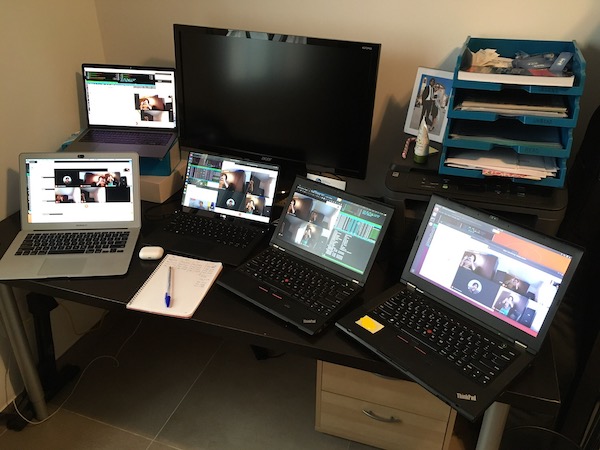
I decided to test drive the five of them: the 2020 MBP, my 2013 MBA, the Thinkpad, the Dell, and my tinkering laptop, a Thinkpad x230 with OpenBSD.
I then spent a couple days trying to make some sense of the situation. You can see them running a group video chat and some benchmarks.
Fortunately, a clear winner emerged: the 2018 Dell XPS with Ubuntu-Dell installed.
How good is the 2018 XPS? Excellent. 9.5/10 would recommend. I got in love with that machine. Very good hardware, with just a few minor issues.
Pros:
- Good screen quality
- Small bezels. It makes a difference and I still miss them today.
- Light, nice in my lap. The Macbook Pros have air vents that "cut" into your legs when you're wearing shorts.
- All I/O worked fine. I used the official Dell Thunderbolt Dock.
- Excellent keyboard. I liked the pgup/pgdn keys on the arrow cluster and welcomed back the function keys.
- Good battery life (6h of streaming video) even though the laptop had been used daily for almost 3 years.
Cons:
- The speakers are of laughable quality. Not just bad, but why-would-Dell-do-that bad. Extremely quiet and terrible quality.
- The webcam is on a bad location. Not really a big deal, but I'm glad they fixed it in recent revisions.
- The trackpad is kinda like the 2013 Air's, but a bit worse.
- Coil whine. I tried to be positive and used it as an "activity indicator" like in the old days of spinning hard drives, but I'd rather not have it.
That really is it. The Dell XPS is probably the best go-to PC laptop. Excellent set of compromises, good price, good support. If you want to use Linux on a laptop, you can't go wrong with the XPS.
2. Doing my job with Linux
I knew beforehand that hardware support was not going to be an issue. Linux drivers in general are pretty good nowadays, and that XPS specifically was designed to work well with Linux, that is why we bought it for the office.
On first boot everything works. Ubuntu is pretty good. Gnome 3 tries to be like a Mac, which I liked, and the basic software is fine for most of the people.
I then installed my work software. Most of it is either standard (email, calendar...) or multi-platform via Electron or webapps. For Windows-specific software I purchased a license of Crossover and also installed a Windows 10 VM on Virtualbox. It was not super convenient and sometimes things crashed with Crossover, but I could manage.
Overall, the desktop environment and base apps are not as polished as macOS, which I will discuss later, but it worked.
I am happy to realize that I can continue recommending Linux to "regular people" who want a computer that just works, doesn't get viruses, and is very low maintenance.
3. My self-hosted cloud setup
This is a topic that is on everybody's mind right now. We went from the original, decentralized internet, to a network centralized in a few vendors like Facebook, Google, Cloudflare and Amazon, and I think that is a bad idea.
The walled garden is comfortable, but what happens when you want to make the switch? How easy it really is to migrate your online infrastructure to another vendor?
Well, I was going to discover that soon. I like the iCloud ecosystem, and in general am fine with Apple's privacy policies, but I just couldn't continue using it. Apart from email, all other services (pictures, calendars, files, notes, etc.) cannot be used in Linux, and the browser client is extremely bad.
I am a geek, and have been a sysadmin since college, so I took it as a personal challenge to create my own personal cloud infrastructure.
First I tried Nextcloud. It mostly works and I recommend it in general, but the server components are too heavy and the file syncing is slow and unreliable.
I decided to self-host every individual piece of the puzzle:
- My mail has been managed by postfix/dovecot for a few years now. I don't recommend anybody self-hosting email due to deliverability issues, but I'm that stubborn.
- I set up radicale for contacts, calendars and tasks. It had issues connecting to some clients due to, I believe, SSL negotiation. If I had to set it up again I'd try another alternative.
- All my files got synced over my laptops and the server thanks to Syncthing. I can't stress enough how great of a software is Syncthing. Really, if you're looking for an alternative to Dropbox, try it out. It will amaze you.
- Syncthing does not expose files publicly, so I span up the Apache Webdav server to share files.
- Joplin is a good alternative to take rich text notes and sync them over the internet. The clients are not very polished, but it works.
- For passwords I've been using Lastpass for some time.
- I kept using iCloud for pictures, because it's the best solution if you have an iPhone. It is fine because I don't need to work with pictures on my daily workflow.
It took some time of researching and deploying all the pieces, and I'm quite happy with the result. It feels really great to manage your online infrastructure, even though it requires technical knowledge and regular maintenance to keep everything up to date.
So how did it all work out?
Well, I have been repeating this term all over the article: it works. I could do my job, and it was a very gratifying learning experience. Overall, I do encourage geeks to spin up their own cloud infra and work with Linux or BSD boxes. I do have some self-hosted cloud services and I also keep a laptop with OpenBSD which I use regularly.
It is possible to get out of the walled garden. Of course, it's not within reach of the general public yet, even though Nextcloud is very close, and some third party vendors are starting to offer an integrated cloud experience outside the world of the Big Cloud.
But I'm writing this in the past tense because I went back to the Mac. Unfortunately, after six months of using this setup full-time I started noticing very rough edges, which I will explain on the next article.
Stay tuned!
Continue reading...
Damn Small Linux on a Libretto 50CT
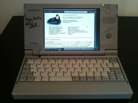
In about 2004 a friend from college got into his hands a series of Toshiba Libretto 50CT. They all came with Windows 95 pre installed, and we wiped them out and installed Debian with a 2.2 kernel from floppies, with much pain because of the unsupported disk drive. I remember it being so difficult that I don't even want to write about it. But it booted and was able to run Vim, Links, and connect to the internet. Enough for a network-enabled typewriter.
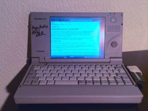
I got Richard Stallman to sign mine while it was running GNU/Linux, but when I bought a regular laptop I stopped using it because, well, it is too old, and its keyboard is too tiny to type comfortably with it.
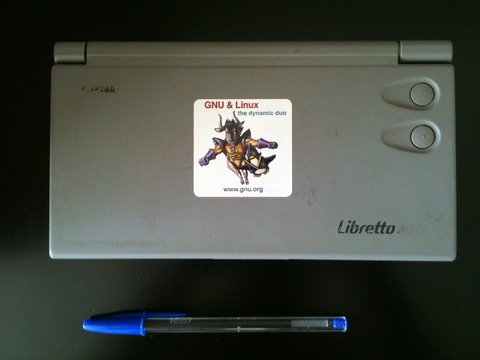
The Libretto, closed. It is a tiny machine, a wonderful piece of engineering.
Around 2012 I found it inside a box at home, working perfectly, with a battery life of a bit less than an hour—which is incredible for a 12+ year old machine— and DR-DOS installed. I can't remember why I did that, but Golden Axe was also installed, so there's a hint.
I decided to install a modern Linux and, at least, store it on a working condition to give some justice to Stallman's signature.
There are some tutorials available on the net, but none of them covered 100% of the hardware support for my machine. Most of them are also outdated, and refer to distributions that don't exist, don't have any support or are about unusable nowadays. However, I took many hints from those tutorials, and I will reference them accordingly.
Hardware
This laptop has a 75 MHz —actually, mine reports 74 MHz— with 24 MB of RAM, which is an upgrade from the original 16 MB which are usually bundled. The screen is 640x480, and if you choose a higher resolution, instead of scaling the image, it only displays the upper-leftmost 640x480 pixels, leaving the bottom and rightmost part of the area out of sight.
The mouse device is emulated as a PS/2, and physically is a "clitoris"-like pointing device. You know what I mean. Working with the X windows is a pain in the neck because the location of the mouse and buttons isn't very ergonomic, and clicking on a button makes the whole screen move on its hinges.
Next to the mouse there is a speaker which is similar in quality to those of a modern smartphone.
This device doesn't have any extension port other than a dock connector for a dock I don't have, and a 16-bit PCMCIA slot, which you will need for the network card. It doesn't have a COM port or anything like that, which is understandable, given the size of the case.
It does have an Infrared device, which is quite slow and useless, but for its time it was as good as wireless could get. The other holes correspond to the power adapter and the reset button next to the PCMCIA, big enough to be able to reset the laptop with a regular pen.
For the full specifications, please refer to the official leaflet.
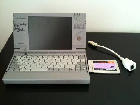
The setup I will be using: the Libretto, and a 3Com 16-bit PCMCIA Ethernet card
Choosing a Linux distribution
I wanted to find some modern, low-demanding software, not unsupported versions of Debian or RedHat. As you might have expected by this page's title, I chose Damn Small Linux (DSL).
I was very lucky to find that my machine had been upgraded to 24 MB of RAM. Apparently, even low-end distros have difficulties booting a regular kernel with 16 MB. I didn't want to tune or recompile the kernel on a 75-MHz machine, so I had to do some tricks.
In order to decide on a distro, I tried to set some goals up:
- Discard modern distributions which require at least 256 MB of RAM. In fact, discard anything that doesn't work with 24 MB of RAM
- Try to avoid old versions of current distros (i.e. Debian Woody) because the ISOs and the packages might not be mirrored anymore and are difficult to be found.
- Use a distro which self-configures kernel modules on boot, because I will be installing from a Virtual Machine and the hardware will change between reboots. Recompiling the kernel is totally out of the picture.
- Kernel 2.4 if possible, to make both the audio and the Ethernet work
- As easy to configure as possible. I want to finish this in a few hours... [Narrator: he didn't]
I found myself with these contenders, Damn Small Linux, Puppy Linux and Tiny Core Linux.
DSL v4 was the chosen one for many reasons. First, the default software choice is a good compromise and finely tuned for low performing machines. The installation seemed the easiest of the three, and—very important—worked flawlessly inside VirtualBox. The documentation is very extensive and, as a slightly old distro, there are lots of manuals and forum posts with solutions to common problems.
There is also the fact that DSL is based on Knoppix, so it detected my hardware perfectly, didn't have to tweak the PCMCIA, and only had to configure the audio manually because the I/O ports were not the standard ones. This was a huge aid for me. PCMCIA Internet working out of the box is something I hadn't even imagined to have.
However, the decision also came with a few drawbacks. DSL has its own "package manager", which only works from X and can't uninstall packages.
apt-get can be enabled, but it might break packages already installed with MyDSL.
Furthermore, those packages tend to disappear on a reboot for some reason. I'm
still unsure on whether to use apt-get with MyDSL. We will not be using it.
The ACPI doesn't work, but I don't know whether it's the kernel or the Libretto's fault.
My biggest fear, however, is that most of the packages are old and might have security issues. However, as this will not be my main machine, and it won't run a browser with JavaScript enabled, I'm not very worried.
Why didn't I choose Tiny Core? because it didn't boot on a VirtualBox machine with 24 MB of RAM. It would have been my first choice, because it is better maintained than DSL. A real pity.
And what about Puppy? The LiveCD is great but the installation instructions were too complicated for me. I really didn't want to spend that much time configuring everything. It is maybe too modern (based on Slackware 13.37 with Kernel 3.1.10) and I doubt the Libretto could have handled its kernel.
Installation
Please note: I will assume that you have some experience with Linux, partitioning, and installing stuff from a console.
Strategy
There are two alternatives: use floppy disks or physically remove the drive and set up a VM. Years ago, I went the first path, because I had the floppy disk drive. Since I don't have it anymore, I found an awesome tutorial which suggested to physically remove the drive from the Libretto, attach it to a 2.5" IDE to USB adaptor, and install the system from another computer. Check out his pictures for details on how to remove the drive. My machine is in a bad condition (broken hinges, cracks all over the case, stuck screws) and I had to break some plastics and metal parts to access the drive.
So, we will use another Linux computer, which you probably already have, and set up a virtual machine inside VirtualBox. Then, we will remove the Libretto's physical HDD and attach it via USB to your computer, using an adapter. The DSL CD image and the new /dev/sd will be mapped inside the VM.
This way we can boot and install from a CD, instead of doing netinsts with the Debian Woody diskettes, as you will read on many other websites. It is the fastest and painless way, and if you don't have the floppy drive, it is the only way.
If you have the floppy drive and are wondering if it is worth to buy the adapter, go ahead! Walk the difficult path, install DOS, start a Linux setup from DOS, try to make the floppy disk work, then install from diskettes with a crappy kernel, fight with the PCMCIA driver until you are able to use the network, and install from the net. And, should the installation fail, start OVER AGAIN! When this happens, please send me an email so that I can pretend that I sympathize with you but actually laugh at your misery.
Talking seriously, I am just trying to warn you. I tried that, I failed, then I succeeded, and not even in my success I want even the worst of my enemies going that path. Buy it, then come back and follow these instructions.
Removing the hard drive
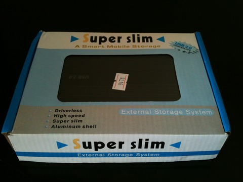
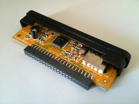
You already have the adapter? Great! I bought this one which worked great and allowed me to manipulate the drive from my main computer.
This is the adapter in its box. It comes with an enclosure that I didn't use to avoid overheating, and a handy screwdriver.
A close up of the IDE adapter. Don't buy a SATA one by mistake!
Using the drive in VirtualBox
As stated before, we will use VirtualBox to make DSL think it is
running on a real machine, and that the—now USB— hard drive is the
main drive of the VM. Turns out that using a physical disk from /dev on
VirtualBox isn't easy to find, but the actual command is simmple.
Please make sure that your Linux has detected the USB drive as /dev/sdb before proceeding or you might lose data on the wrong disk!
If in case, use Disk Utility or check dmesg.
VBoxManage internalcommands createrawvmdk -filename disk.vmdk -rawdisk /dev/sdb
                                                                       ^^^^^^^^  <-- check this
The command above will create a file named disk.vmdk, which is a
short plaintext file which references to /dev/sdb. You can now add
it to your VM using the normal VirtualBox Appliance Manager
Partitioning
Use your main Linux box to partition the hard drive. Disk Utility works well, but I used cfdisk.
The tutorial then notes that the last 32MB of the disk space are used for the Libretto's hardware Hibernate feature. I followed his partition table suggestions completely. Just in case his page is down, do this:
/dev/hda1738.0 MB,ext2(ext3 is slower, but more secure), mounted as//dev/hda240.3 MB,swap- A remaining free space of 37.2 MB. Don't worry if the figure is slightly higher or lower due to rounding.
Installing DSL
Now go ahead, and download the ISO image. I used the Release Candidate 4.11.rc1 and it didn't give me any problems
Set up a new VM with 24 MB of RAM, use the ISO as the CD drive, and the disk.vmdk as the hard drive. Then boot.
If everything goes well, you will be shown the desktop. Now, in order to install, I have adapted the official instructions
sudo -s
swapoff -a
mkswap /dev/hda2 ## Considering that you followed the partition scheme in the tutorial
swapon /dev/hda2
dsl-hdinstall
Follow the setup assistant from there. I chose Grub instead of LILO
for the bootloader, and it worked. The network also works out of
the box, so I didn't need to apply any modifications in
/etc/default/pcmcia as stated in David's tutorial.
Now disconnect the USB adapter, remove the disk, put it back in the Libretto, and boot. You should be prompted with either the console login or a X desktop, depending on your setup.
Network
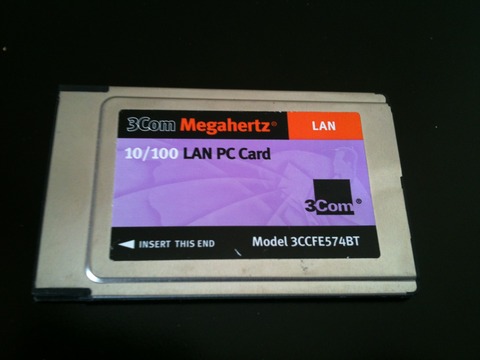
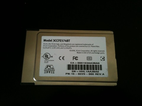
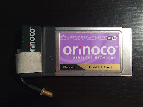
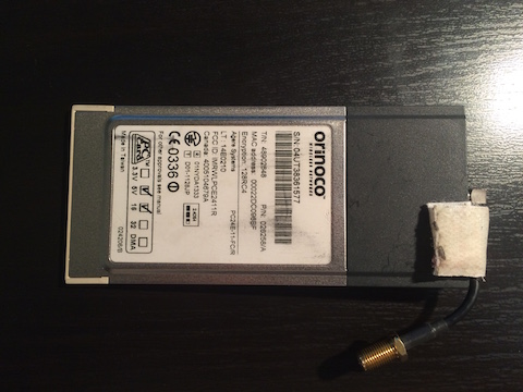
I have a PCMCIA 16-bit 5V 3Com Ethernet adapter and just recently acquired a wireless Orinoco Gold card, 16b 5V too, one of the few known to work with this Libretto model, albeit only in WEP-mode.
This Libretto only accepts Type II PCMCIA, so it is very difficult to find a Linux 2.4 compatible, WPA-capable wifi card. Please let me know if you managed to get WPA wifi working!
Here are some pictures, as a reference.
The 3Com card, front
The 3Com card, back. Note the "PC card" icon with the technical specs.
The Knoppix core of DSL detected my Ethernet card, configured it with DHCP, and it talked instantly to my home router. Woohoo, it's on the Internet! I actually didn't need to do anything, compared to the hell I suffered with the Debian setup some years ago.
Wireless
Again, thanks to the Knoppix core, the Libretto automatically detected the PCMCIA card, loaded the
orinoco kernel module, and the card was ready to use.
First, prepare your wireless router to work with WEP. It is highly discouraged to do so, because it is a big security hole. Fortunately I had a spare router that I can use only for the Libretto and will turn it off after playing with it.
My recommended setup for the router is:
- Hide the ESSID
- Filter by MAC address
- Use 802.11b with auto channel
- Use a 128-bit ASCII WEP key
I tuned /opt/eth0.sh to run the iwconfig commands. Add this just below the #!/bin/bash line:
iwconfig eth0 essid ESSID_NAME
iwconfig eth0 key open s:WEPKEY
iwconfig eth0 mode managed
sleep 1
If you WEP key is hex and not ASCII, omit the s: part before it.
Wait for a few seconds, and when iwconfig reports a correct Access Point, you're on the internet.
Congratulations!
Since the 50CT has very low specs, Firefox starts swapping like crazy. The best commandline browser
is links2 and I recommend dillo if you run X.
Look ma, no cables!
Sound
This other tutorial
points out some tricks to use all of the Libretto's capabilities. I
didn't try most of them, but since I couldn't play any music, I
went ahead and probed the opl3sa2 driver. At first, it didn't work,
because the I/O parameters on my card weren't the same than on that
page.
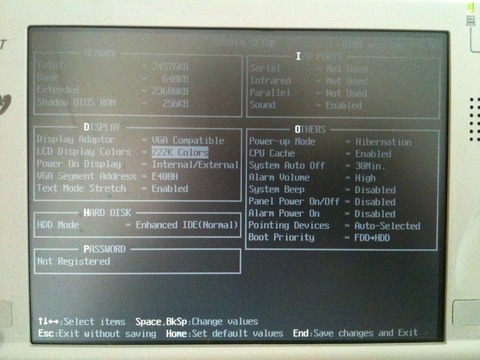
This is my main BIOS configuration
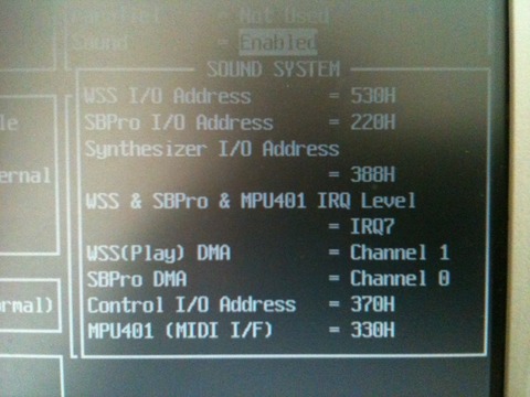
A detail of the audio section. From top to bottom, the values correspond to the following module parameters
- mss_io
- not used
- not used
- irq
- dma
- dma2
- io
- mpu_io
This means that we will load the module with the following parameters. Remember to check your BIOS and use the correct ones, or modprobe will fail
modprobe opl3sa2 io=0x370 mss_io=0x530 mpu_io=0x330 irq=7 dma=1 dma2=0
Note: to access the Libretto BIOS, reboot or reset it, and press <ESC> during or just after the memory check
Finally, the Pentium 75 CPU is able to play most mp3 files, but you
will need to compile your own mpg123. DSL
comes with mpg321, but the audio isn't fluid and for some reason
only mpg123 is able to decode mp3 in realtime. Running it from a
console instead of an X session also helps, though the main
bottleneck is the CPU, not the RAM
ACPI/APM/Battery
I only managed to get APM working. Playing with the Grub boot options there is no way to enable ACPI.
This blog post has some pointers on how to install the Toshiba experimental ACPI driver, but as I didn't want to recompile the kernel, I couldn't use it. If you feel strong enough, use the same Virtual Machine that you used for the DSL install and recompile it there, with the power of a current computer.
The toshiba kernel module loads correctly (/proc/toshiba), but not
toshiba_acpi (/dev/toshiba). Not a big deal for me, but if you
managed to get it working without recompiling the Knoppix kernel,
please let me know.
The Libretto does some power management by hardware (screen
blanking, hibernation), and this is enough for me. However, to get
the system to actually power off after a shutdown, edit the
/boot/grub/menu.lst and change the parameter noapm to apm=on
apm=power-off
torsmo, DSL's dashboard, usually manages to get my battery status,
but I didn't investigate further.
Performance tricks
Here are some generic tips on how to save some RAM and CPU cycles
- Enable DMA - For some reason, DSL disables DMA by default.
To enable it, edit the Grub config file
/boot/grub/menu.lstand change the boot parameternodmafordma. You will then see a boot message saying that DMA has been enabled for/dev/hda - Disable ttys - Edit
/etc/inittaband disable all consoles but one. Instead, run a GNUscreensession to get terminal multiplexing. - No X - Disable the automatic X session that is launched on
login. You might need to edit the
.bashrcor the.bash_profilefiles. Comment out thestartxcommand. - GNU tools - With those bytes we saved, use the DSL menu option "Upgrade to GNU tools" to replace the very basic BusyBox shell with the regular GNU tools.
- Fix the date - Use MyDSL to install
ntpdateand run it when coming back from hibernation, since the date will probably be incorrect:ntpdate ntp.apple.com
Currently my setup takes the following resources:
- Used memory with X running: 10 MB
- Used memory without X running: 3 MB
- Used disk space: 290 MB
Not bad, right? 3 MB of RAM on boot and a full functioning X taking only 7 MB more. That leaves a whooping 14 MB for applications!
As the pointing device is not that great, I usually run a single
tty with a screen session for terminal multiplexing, and do most of
my work on the terminal. X is only needed for viewing PDFs or
images, and that's a perfectly suitable task for that computer.
Final words
I find it amazing that a laptop from early 2001 can still hold about an hour of battery, its drive is still spinning, and that it overall works. DSL gave it a new life, and though it is tedious to use a cable or WEP to connect to the internet, it is a functioning UNIX system, with audio and a decent mobile typewriter. Yes, the keyboard is small and uncomfortable, but this thing fits in any bag. Why, by 1990s standards, it would "fit in your pocket"!
There is plenty of information out there on installing Linux on a Libretto, but at the time of writing this article, most of articles are about 7-10 years old. I hope that it can be useful for somebody who, like me, found this machine at the bottom of a drawer and might want to play with it a little, install a current Linux and maybe give it to your kids or use it as a second laptop.
I wouldn't use it as a server, since it has little memory to run a server daemon, the disk and fan are noisy, and keeping it on 24/7 would burn the machine. If you want a cheap server, go for an old Mac Mini and install the latest Debian there. The Libretto is a ultra portable laptop and, if yours still holds some battery charge, is a nice toy to write stuff on or browse the simple internet.
DSL is highly customizable, and there is plenty of documentation out there. The default software is great, and searching the net you will find current software which is suitable for low memory devices. You will find yourself with a machine capable of reading and writing emails, displaying images, playing music, and more.
The only sites it can't browse are those which use Flash or are heavy on JavaScript. Well, the modern web, Gmail, Facebook, Twitter... but if you try to use the mobile versions you might get a nice surprise. You can try to use the Firefox version bundled in DSL but I wouldn't recommend that, it's too slow.
Feel free to contact me if there is any mistake on the tutorial or if you have some contribution, for example, a command to make it run with WPA, or if you managed to make the ACPI work.
The Libretto running an X session
Originally published on Github in 2013
Seven years later, I bought a new Macbook. For the first time, I don't love it
This article is part of a series:
The 2013 Macbook Air is the best computer I have ever owned. My wish has always been that Apple did nothing more than update the CPU and the screen, touching nothing else. I was afraid the day of upgrading my laptop would come.
But it came.
My Air was working flawlessly, if only unbearably slow when under load. Let me dig a bit deeper into this problem, because this is not just the result of using old hardware.
When video conferencing or under high stress like running multiple VMs the system would miss key presses or mouse clicks. I'm not saying that the system was laggy, which it was, and it is expected. Rather, that I would type the word "macbook" and the system would register "mok", for example. Or I would start a dragging event, the MouseUp never registered but the MouseMove continued working, so I ended up flailing an icon around the screen or moving a window to some unexpected place.
This is mostly macOS's fault. I own a contemporary x230 with similar specs running Linux and it doesn't suffer from this issue. Look, I was a computer user in the 90s and I perfectly understand that an old computer will be slow to the point of freezing, but losing random input events is a serious bug on a modern multitasking system.
Point #1: My old computer became unusable due to macOS, not hardware, issues.
As I mentioned, I had been holding on my purchase due to the terrible product lineup that Apple held from 2016 to 2019. Then Apple atoned, and things changed with the 2019 16". Since I prefer smaller footprints, I decided that I would buy the 13" they updated next.
So here I am, with my 2020 Macbook Pro, i5, 16 GB RAM, 1 TB SSD. But I can't bring myself to love it like I loved my 2013 Air.
Let me explain why. Maybe I can bring in a fresh perspective.
Most reviewers evaluate the 2020 lineup with the 2016-2019 versions in mind. But I'm just some random person, not a reviewer. I have not had the chance to even touch any Mac since 2015. I am not conditioned towards a positive judgement just because the previous generation was so much worse.
Of course the new ones are better. But the true test is to compare them to the best laptops ever made: 2013-2015 Airs and Pros.
Point #2: this computer is not a net win from a 2013 Air.
Let me explain the reasons why.
The webcam
You will see the webcam reviewed as an afterthought in most pieces. I will cover it first. I feel like Apple is mocking us by including the worst possible webcam on the most expensive laptop.
Traditionally, this has been a non-issue for most people. However, due to covid-19 and working from home, this topic has become more prominent.
In my case, even before the pandemic I used to do 2-3 video conferences every day. Nowadays I spend the day in front of my webcam.
What infuriates me is that the camera quality in the 2013 Air is noticeably better. Why couldn't they use at least the same part, if not a modern one?
See for yourself. It really feels like a ripoff. Apple laughing at us.

The 2020 macbook pro webcam looks horrible, and believe me, it is not only due to Yours Truly's face.

A reasonable quality picture from the 2013 Air

For reference, this is the front facing camera of the 2016 iPhone SE, same angle and lighting conditions.

As a second reference, a picture taken with the 640x480 VGA camera of my 2006
Nokia 5200. Which of the above looks the most like this?
I would have paid extra money to have a better webcam on my macbook.
The trackpad
The mechanism and tracking is excellent, but the trackpad itself is too large and the palm rejection algoritm is not good enough.
Point #3: The large trackpad single-handedly ruins using the experience of working on this laptop for me.
I am constantly moving the cursor accidentally.
This situation is very annoying, especially for a touch typist as my fingers are always on hjkl and my thumb on the spacebar. This makes
my thumb knuckle constantly brush the trackpad and activate it.
I really, really need to fix this, because I have found myself unconsciously raising my palms and placing them at a different angle. This may lead to RSI, which I have suffered from in the past.
This is a problem that Apple created on their own. Having an imperfect palm rejection algorithm is not an issue unless you irrationally enlarge the trackpad so much that it extends to the area where the palm of touch typists typically rests.
Is it worth it to antagonize touch typists in order to be able to move the cursor from this tiny corner?
I would accept this tradeoff if the trackpad was Pencil-compatible and we could use it as some sort of handwriting tablet. That would actually be great!
Another very annoying side effect of it being so large is that, when your laptop is in your lap, sometimes your clothes accidentally brush the trackpad. The software then registers spurious movements or prevents some gestures from happening because it thinks there is a finger there.
In summary, it's too big for no reason, which turns it into an annoyance for no benefit. This trackpad offers a bad user experience, not only that, it also ruins the keyboard—read below.
I would have paid extra money to have a smaller trackpad on my macbook.
The keyboard
The 2015 keyboard was very good, and this one is better. The keyswitch mechanism is fantastic, the layout is perfect, and this is probably the best keyboard on a laptop.
Personally, I did not mind the Escape key shenanigans because I remapped it to dual Ctrl/Escape years ago, which I recommend you do too.
Touch ID is nice, even though I'm proficient at typing my password, so it was not such a big deal for me. Face ID would have been much more convenient, I envy Windows Hello users.
Unfortunately, the large trackpad torpedoes the typing experience. Writing on this Macbook Pro is worse than on my 2013 Air.
I will keep searching for a tool which disables trackpad input within X miliseconds of a key press or disables some areas of the trackpad. I have not had any luck with neither Karabiner nor BetterTouchTool.
The Touchbar
After having read mostly negative feedback about it, I was determined to drill myself to like it, you know, just to be a bit contrarian.
"I will use tools to customize it so much that it will be awesome as a per-application custom function layer!"
Unfortunately, the critics are right. It's an anti-feature. I gave it an honest try, I swear. It is just bad, though it could have been better with a bit more effort.
I understand why it's there. Regular users probably find it useful and cute. It's ironically, a feature present in pro laptops meant for non-pro users: slow typists and people who don't know the regular keyboard shortcuts.
That being said, I would not mind it, probably would even like it, if it weren't for three major drawbacks:
First and foremost, it is distracting to the point that the first thing I did was to search how to completely turn it off.
This is because, by default, it offers typing suggestions. Yes, while you are typing and trying to concentrate, there is something in your field of vision constantly flashing words that you didn't mean to type and derailing your train of thought.
Easy to fix, but it makes me wonder what were Apple product managers thinking.
Secondly, it is placed in such a way that resting your fingers on top of the keyboard trigger accidental key presses.
I can and will retrain my hand placement habits. After all, this touchbar-keyboard-trackpad combo is forcing many people to learn to place their hands in unnatural positions to accommodate these poorly designed peripherals.
However, Apple could have mitigated this by implementing a pressure sensor to make it more difficult to generate involuntary key presses. It would be enough to distinguish a brush from a tap.
Finally, and this is also ironic because it's in contradiction with the previous point, due to lack of feedback, sometimes you're not sure whether you successfully pressed a touchbar key. And, in my experience, there is an unjustifiable large number of times where you have to press them twice, or press very deliberately to activate that key you want.
There are some redeeming features, though.
As stated above, I am determined to make it bearable, and even slightly useful for me, by heavily modifying it.
I suggest you go to System Preferences > Keyboard and use the "Expanded Control Strip".
Then, customize the touchbar buttons, remove keys you don't use, and add others. Consider paying for BetterTouchTool for even more customization options.
Then, on the same window, go to the Shortcuts tab, and select Function keys on the left. This allows you
to use function keys by default in some apps, which is useful for Terminal and other pro apps like Pycharm.
(Get the third irony? To make the touchbar, a pro feature, useful for pro apps, the best setup is to make it behave like normal function keys)
Finally, if you're registering accidental key presses, just leave an empty space in the touchbar to let your fingers rest safely until you re-train your hands to rest somewhere else. This is ridiculous, but hey, better than getting your brightness suddenly dimming to zero accidentaly.
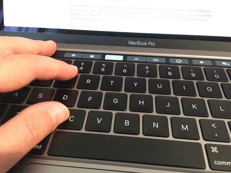
Leave an empty space in the touchbar on the area where you are used to rest your fingers.
I would have paid extra money to not have a touchbar on my macbook.
The ports
Another much-debated feature where I resigned myself to just accept this new era of USB-C.
I did some research online and bought the "best" USB-C hub, along with new dongles. I don't mind dongles, because I was already using some with my Air. It's not like I swim in money, but there is no need to blow this out of proportion.
Well, I won't point any fingers to any review site, but that "best" hub is going back to Amazon as I write these lines. Some of my peripherals disconnect randomly, plus I get an "electric arc" noise when I disconnect the hub cable. I don't know how that is even possible.
The USB-C situation is terrible. Newly bought peripherals still come with USB-A cables. Regarding hubs, it took me a few years to find a reliable USB3 hub for my 2013 Air. I will keep trying, wish me luck.
About Magsafe, even though I really liked it, I don't miss it as much as I expected. I do miss the charging light, though. No reason not to have it integrated in the official cable, like the XPS does.
Some people say that charging via USB-C is actually better due to standardization of all devices, but I don't know what periperals these people use. My iPhone and Airpods charge via Lightning, my Apple Watch charges via a puck, and other minor peripherals like cameras and external batteries all charge via micro-USB. Now I have to carry the same amount of cables as before, I just swapped the Magsafe cable and charger for the USB-C cable and charger.
Another poorly thought decision is the headphone jack. It is on the wrong side. Most of the population is right-handed, so there usually is a notebook, mouse, or other stuff to the right of the laptop. The headphones cable then gets in the way. The port should have been on the left, and close to the user, not far away from them, to gain a few extra centimeters to the cable.
By the way, not including the extension cord is unacceptable. This cord is not only a convenience, but it increases safety, because it's the only way to have earth grounding for the laptop. Without it, rubbing your fingers on the surface of the computer generates this weird vibration due to current. I have always recommended Mac users that they use their chargers with the extension cable even if they don't need the extra length.
I would have paid extra money to purchase an Apple-guaranteed proper USB-C hub. Alternatively, I would have paid extra money for this machine to have a couple of USB-A ports so I can keep using my trusty old hub.
I would not have paid extra money to have the extension cord, because it should have come included with this 2,200€ laptop. I am at a loss for words. Enough of paying extra money for things that Apple broke on purpose.
Battery life
8-9 hours with all apps closed except Safari. Browsing lightly, with an occasional video, and brightness at the literal minimum. This brightness level is only realistic if it's night time. In a normally lit environment you need to set the brightness level at around 50%.
It's not that great. My Air, when it was new, easily got 12 hours of light browsing. Of course, it was not running Catalina, but come on.
When I push the laptop a bit more, with a few Docker containers, Pycharm running, Google Chrome with some Docs opened, and brightness near the maximum, I get around 4 hours. In comparison, that figure is reasonable.
Overall, it's not bad, but I expected more.
While we wait for a Low Power Mode on the mac, do yourself a favor and install Turbo Boost Switcher Pro.
The screen
Coming from having never used a Retina screen on a computer, this Macbook Pro impressed me.
Since I don't edit photos or videos professionally, I can only appreciate it for its very crisp text. The rest of features are lost on me, but this does not devalue my opinion of the screen.
The 500-nit brightness is not noticeable on a real test with my 2013 Air. For some reason, both screens seem equally bright when used in direct daylight.
This new Retina technology comes with a few drawbacks, though.
First, it's impossible to get a terminal screen without anti-aliasing. My favorite font, IBM VGA8, is unreadable when anti aliased, which is a real shame, because I've been using it since the 90s, and I prefer non-anti-aliased fonts on terminals.
Additionally, many pictures on websites appear blurry because they are not "retina-optimized". The same happens with some old applications which display crappy icons or improperly proportioned layouts. This is not Apple's fault, but it affects the user experience.
Finally, the bezels are not tiny like those in the XPS 13, but they are acceptable. I don't mind them.
To summarize, I really like this screen, but like everything else in this machine, it is not a net gain. You win some, you lose some.
Performance
This is the reason why I had to switch from my old laptop, and the 2020 MBP delivers.
It allows me to perform tasks that were very painful in my old computer. Everything is approximately three times faster than it was before, which really is a wow experience, like upgrading your computer in the 90s.
Not much to add. This is a modern computer and, as such, it is fast.
Build quality
Legendary, as usual.
To nitpick on a minor issue, I'd like Apple to make the palm rest area edges a bit less sharp. After typing for some time I get pressure marks on my wrists. They are not painful, but definitely discomforting.
Likewise, when typing on my lap, especially when wearing sports shorts in summer like I'm doing right now, the chassis leaves marks on my legs near the hinge area. Could have been reduced by blunting the edges too.
One Thousand Papercuts
In terms of software, Apple also needs to get its stuff together.
Catalina is meh. Not terrible, but with just too many annoyances.
- Mail keeps opening by itself while I'm doing video conferences and sharing my screen. I have to remind myself to close Mail before any video conference, because if I don't, other people will read my inbox. It's ridiculous that this bug has not been fixed yet. Do you remember when Apple mocked Microsoft because random alert windows would steal your focus while you were typing? This is 100x worse.
- My profile picture appears squished on the login screen, and there is no way to fix it. The proportions are correctly displayed on the iCloud settings window.
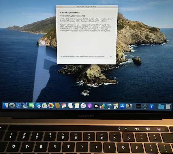
- Sometimes, after resuming from sleep, the laptop doesn't detect its own keyboard. I can assure you, the keyboard was there indeed, and note how the dock is still the default one. This happened to me minutes after setting up the computer for the first time, before I had any chance to install software or change any settings.
- I get constant alerts to re-enter my password for some internet account, but my password is correct. Apple's services need to differentiate a timeout from a rejected password, or maybe retry a couple times before prompting.
- Critical software I used doesn't run anymore and I have to look for alternatives. This includes Safari 13 breaking extensions that were important for me. Again, I was prepared for this, but it's worth mentioning.
Praise worthy
Here are a few things that Apple did really well and don't fit into any other category.
- Photos.app has "solved" the photos problem. It is that great. As a person who has 50k photos in their library, going back to pictures of their great grandparents: Thank you, Apple!
- Continuity features have been adding up, and the experience is now outstanding. The same goes for iCloud. If you have an iPhone and a Mac, things are magical.
- Fan and thermal configuration is very well crafted on this laptop. It runs totally silent, and when the fans kick off, the system cools down very quickly and goes back to silent again.
- The speakers are crisp and they have very nice bass. They don't sound like a tin can like most laptops, including the 2013 Air, do.
Conclusion
This computer is bittersweet.
I'm happy that I can finally perform tasks which were severely limited on my previous laptop. But this has nothing to do with the design of the product, it is just due to the fact that the internals are more modern.
Maybe loving your work tools is a privilege that only computer nerds have. Do taxi drivers love their cars? Do baristas love their coffee machines? Do gardeners love their leaf blowers? Do surgeons love their scalpels?
Yes, I have always loved my computer. Why wouldn't I? We developers spend at least eight hours a day touching and looking at our silicon partners. We earn our daily bread thanks to them. This is why we chose our computers carefully with these considerations in mind, why we are so scrupulous when evaluating them.
This is why it's so disappointing that this essential tool comes with so many tradeoffs.
Even though this review was exhaustive, don't get me wrong, most annoyances are minor except for the one deal-breaker: the typing experience. I have written this review with the laptop keyboard and it's been a continuous annoyance. Look, another irony. Apple suffered so much to fix their keyboard, yet it's still ruined by a comically large trackpad. The forest for the trees.
Point #4: For the first time since using Macs, I do not love this machine.
Going back to what "Pro" means
Apple engineers, do you know who is the target audience for these machines?
This laptop has been designed for casual users, not pro users. Regular users enjoy large trackpads and Touch Bars because they spend their day scrolling through Twitter and typing short sentences.
Do you know who doesn't, because it gets in the way of them typing their essays, source code, or inputting their Photoshop keyboard shortcuts? Pro users.
In 2016 I wrote:
However, in the last three to five years, everybody seemed to buy a Mac, even friends of mine who swore they would never do it. They finally caved in, not because of my advice, but because their non-nerd friends recommend MBPs. And that makes sense. In a 2011 market saturated by ultraportables, Windows 8, and laptops which break every couple years, Macs were a great investment. You can even resell them after five years for 50% of their price, essentially renting them for half price.
So what happened? Right now, not only Pros are using the Macbook Pro. They're not a professional tool anymore, they're a consumer product. Apple collects usage analytics for their machines and, I suppose, makes informed decisions, like removing less used ports or not increasing storage on iPhones for a long time.
What if Apple is being fed overwhelmingly non-Pro user data for their Pro machines and, as a consequence, their decisions don't serve Pro users anymore, but rather the general public?
The final irony: Apple uses "Pro" in their product marketing as a synonymous for "the more expensive tier", and they are believing their own lies. Their success with consumer products is fogging their understanding of what a real Pro needs.
We don't need a touchbar that we have to disable for Pro apps.
We don't need a large trackpad that gets in the way of typing.
We need more diverse ports to connect peripherals that don't work well with adapters.
We need a better webcam to increase productivity and enhance communication with our team.
We need that you include the effin extension cable so that there is no current on the chassis.
We need you to not splash our inbox contents in front of guests while sharing our screens.
We need a method to extend the battery as long as possible while we are on the road—hoping that comes back some day.
Point #5: Apple needs to continue course-correcting their design priorities for power users
Being optimistic for the future
I have made peace with the fact that, unlike my previous computer, this one will not last me for 7 years. This was a very important factor in my purchase decision. I know this mac is just bridging a gap between the best lineup in Apple's history (2015) and what will come in the future. It was bought out of necessity, not out of desire.
14" laptop? ARM CPUs? We will be awaiting new hardware eagerly, hoping that Apple keeps rolling back some anti-features like they did with the butterfly keyboard. Maybe the Touchbar and massive trackpad will be next. And surely the laggy and unresponsive OS will have been fixed by then.
What about the alternatives?
Before we conclude I want to anticipate a question that will be in some people's mind. Why didn't you buy another laptop?
Well, prior to my purchase I spent two months trying to use a Linux setup full-time. It was close, but not 100% successful. Critical software for my job had no real alternatives, or those were too inconvenient.
Regarding Windows, I had eyes on the XPS 13 and the X1 Carbon which are extremely similar to this macbook in most regards. I spent some time checking if Windows 10 had improved since the last time I used it and it turns out it hasn't. I just hate Windows so much it is irrational. Surely some people prefer it and feel the same way about the Mac. To each their own.
Point #6: Despite its flaws, macOS is the OS that best balances convenience with productive work. When combined with an iPhone it makes for an unbeatable user experience.
I decided that purchasing this new Mac was the least undesirable option, and I still stand by that decision. I will actively try to fix the broken trackpad, which will increase my customer satisfaction from a 6 —tolerate— to an 8 or 9 —like, even enjoy—.
But that will still be far away from the perfect, loving 10/10 experience I had with the 2013 Air.
Continue reading...
Slow down your laptop
800 Mega Hertz is enough (via) argues that for most use cases laptops don't need to run at their top speed to save battery.
Computers are amazing; they are so fast and can do so much. Nevertheless, what if we didn't need it to be so fast or do so much? That was the question I asked myself when I was trying to improve the battery life of my laptop even further. I came up with a simple solution. The processor that came in my computer runs at 2.2GHz, that isn't fast compared to modern laptops today, but it is still much faster than I need it to be. Each clock cycle uses a little bit of power, and if all I'm doing is typing out Latex documents, then I don't need that many clock cycles. I don't need one thousand four hundred of them to be precise.
The only caveat is that modern web browsing is definitely much more taxing than "typing out latex documents." You are running almost an entire graphical OS in each tab. And, if I'm not mistaken, most frequency managers actually slow down CPUs to a crawl when they're idle. Other than that, I'm all in on this.
In my own experience, disabling Turbo Boost is barely noticeable and extends battery life for about an hour,
which translates to around 20% extra life.
I actually have a script called lpm.sh, for "low power mode" that essentially stops syncthing, an important source
of CPU wakeups, and disables turbo boost to grant me those extra minutes. CPU frequency is properly managed in my case and
I don't have the need to run cpupower manually.
If you truly want to run the most resource-constrained, "distraction-free typewriter mode", boot into single-user mode and write using vim.
Bonus rabbit hole of the day: CPU power management
Tags: hardware, minimalism
What do "Pro" users want?
My current machine is a 2013 i7 Macbook Air. It doesn't have the Pro label, however, It has two USB 3.0 ports, an SD slot and a Thunderbolt port. 12 hours of battery life. One of the best non-retina screens around. Judging by this week's snarky comments, it's more Pro than the 2016 Macbook Pro.
Me, I love this laptop. In fact, I love it so much that I bought it to replace an older MBA. I really hoped that Apple would keep selling the same model with a Retina screen and bumped specs.
But is it a Pro computer or not? Well, let me twist the language. I make my living with computers, so by definition it is. Let's put it another way around: I could have spent more money for a machine which has Pro in its name, but that wouldn't have improved my work output.
What is a Pro user?
So there's this big discussion on whether the Pro label means anything for Apple.
After reading dozens of reviews and blog posts, unsurprisingly, one discovers that different people have different needs. The bottom line is that a Pro user is someone who needs to get their work done and cannot tolerate much bullshit with their tools.
In my opinion, the new Macbook Pros are definitely a Pro machine, even with some valid criticisms. Apple product releases are usually followed by zesty discussions, but this time it's a bit different. It's not only angry Twitter users who are complaining; professional reviewers, engineers, and Pro users have also voiced their concerns.
I think we need to stop thinking that Apple is either stupid or malevolent. They are neither. As a public company, the metric by which their executives are evaluated is stock performance. Infuriating users for no reason only leads to decreasing sales, less benefits, and unhappy investors.
I have some theories on why Apple seems to care less about the Mac, and why many feel the need to complain.
Has the Pro market changed?
Let's be honest: for the last five years Apple probably had the best and most popular computer lineup and pricing in their history. All markets (entry, pro, portability, desktops) had fantastic machines which were totally safe to buy and recommend, at extremely affordable prices.
I've seen this myself. In Spain, as one of the poorest EU countries, Apple is not hugely popular. Macs and iPhones are super expensive, and many find it difficult to justify an Apple purchase on their <1000€ salary.
However, in the last three to five years, everybody seemed to buy a Mac, even friends of mine who swore they would never do it. They finally caved in, not because of my advice, but because their non-nerd friends recommend MBPs. And that makes sense. In a 2011 market saturated by ultraportables, Windows 8, and laptops which break every couple years, Macs were a great investment. You can even resell them after five years for 50% of their price, essentially renting them for half price.
So what happened? Right now, not only Pros are using the Macbook Pro. They're not a professional tool anymore, they're a consumer product. Apple collects usage analytics for their machines and, I suppose, makes informed decisions, like removing less used ports or not increasing storage on iPhones for a long time.
What if Apple is being fed overwhelmingly non-Pro user data for their Pro machines and, as a consequence, their decisions don't serve Pro users anymore, but rather the general public?
First, let's make a quick diversion to address the elephant in the room because, after all, I empathize with the critics.
Apple is Apple
Some assertions you can read on the Internet seem out of touch with a company which made the glaring mistake of building a machine without a floppy, released a lame mp3 player without wireless and less space than a Nomad, tried to revolutionize the world with a phone without a keyboard, and produced an oversized iPhone which is killing the laptop in the consumer market.
Apple always innovates. You can agree whether the direction is correct, but they do. They also copy, and they also steal, like every other company.
What makes them stand out is that they are bolder, dare I say, more courageous than others, to the point of having the courage to use the word courage to justify an unpopular technical decision.
They take more risks on their products. Yes, I think that the current audio jack transition could've been handled better, but they're the first "big brand" to always make such changes on their core products.
This brings us to my main gripe with the current controversy. I applaud their strategy of bringing iPhone ideas, both hardware and software, to the Mac. That is a fantastic policy. You can design a whole device around a touch screen and a secure enclave, then miniaturize it and stick it on a Macbook as a Touch Bar.
Having said that, us pros are generally conservative: we don't update our OS until versions X.1 or X.2, we need all our tools to be compatible, and we don't usually buy first-gen products, unless we self-justify our new toy as a "way to test our app experience on users who have this product".
The Great Criticism Of The 2016 Macbook Pro is mainly fueled by customers who wanted something harder, better, faster, stronger (and cheaper) and instead they got a novel consumer machine with few visible Pro improvements over the previous one and some prominent drawbacks.
Critical Pros are disappointed because they think Apple no longer cares about them. They feel they have no future using products from this company they've long invested in. Right now, there is no clear competitor to the Mac, but if it were, I'm sure many people would vote with their wallets to the other guy.
These critics aren't your typical Ballmers bashing the iPhone out of spite. They are concerned, loyal customers who have spent tens of thousands of dollars in Apple's products.
What's worse, Apple doesn't seem to understand the backlash, as shown by recent executive statements. Feeling misunderstood just infuriates people more, and there are few things as powerful as people frustrated and disappointed with the figures and institutions they respect.
Experiment, but not on my lawn
If I could ask Apple for just one thing, it would be to restrict their courage to the consumer market.
'Member the jokes about the 2008 Macbook Air? Only one port, no DVD drive?
The truth is, nobody cared because that machine was clearly not for them; it was an experiment, which if I may say so, turned out to be one of the most successful ever. Eight years later, many laptops aspire to be a Macbook Air, and the current entry Apple machine, the Macbook "One", is only an iteration on that design.
Nowadays, Apple calls the Retina MBA we had been waiting for a "Macbook Pro". That machine has a 15W CPU, only two ports—one of which is needed for charging—, good enough internals, and a great battery for light browsing which suffers on high CPU usage.
But when Apple rebrands this Air as a Pro, real pros get furious, because that machine clearly isn't for them. And this time, to add more fuel to the fire, the consumer segment gets furious too, since it's too expensive, to be exact, $400 too expensive.
By making the conscious decision of positioning this as a Pro machine both in branding and price point, Apple is sending the message that they really do consider this a Pro machine.
One unexpected outcome of this crisis
Regardless, there is one real, tangible risk for Apple.
When looking at the raw numbers, what Apple sees is this: 70% of their revenue comes from iOS devices. Thus, they prioritize around 70% of company resources to that segment. This makes sense.
Unless.
Unless there is an external factor which drives iPhone sales: the availability of iPhone software, which is not controlled by Apple. This software is developed by external Pros. On Macs.
The explosion of the iOS App Store has not been a coincidence. It's the combination of many factors, one of which is a high number of developers and geeks using a Mac daily, thanks to its awesomeness and recent low prices. How many of us got into iPhone development just because Xcode was right there in our OS?
Similarly to how difficult it is to find COBOL developers because barely anyone learns it anymore, if most developers, whichever their day job is, start switching from a Mac to a PC, the interest for iOS development will dwindle quickly.
In summary, the success of the iPhone is directly linked to developer satisfaction with the Mac.
This line of reasoning is not unprecedented. In the 90s, almost all developers were using the Microsoft platform until Linux and OSX appeared. Nowadays, Microsoft is suffering heavily for their past technical decisions. Their mobile platform crashed not because the phones were bad, but because they had no software available.
Right now, Apple is safe, and Pro users will keep using Macs not only thanks to Jobs' successful walled garden strategy, but also because they are the best tools for the job.
While Pro users may not be trend-setters, they win in the long term. Linux won in the server. Apple won the smartphone race because it had already won the developer race. They made awesome laptops and those of us who were using Linux just went ahead and bought a Mac.
Apple thinks future developers will code on iPads. Maybe that's right 10 years from now. The question is, can they save this 10-year gap between current developers and future ones?
The perfect Pro machine
This Macbook Pro is a great machine and, with USB-C ports, is future proof.
Dongles and keyboards are a scapegoat. Criticisms are valid, but I feel they are unjustly directed to this specific machine instead of Apple's strategy in general. Or, at least, the tiny part that us consumers see.
Photographers want an SD slot. Developers want more RAM for their VMs. Students want lower prices. Mobile professionals want an integrated LTE chip. Roadies want more battery life. Here's my wish, different than everybody else's: I want the current Macbook Air with a Retina screen and 20 hours of battery life (10 when the CPU is peaking)
Everybody seems to be either postulating why this is not a Pro machine or criticizing the critics. And they are all right.
Unfortunately, unless given infinite resources, the perfect machine will not exist. I think the critics know that, even if many are projecting their rage on this specific machine.
A letter to Santa
Pro customers, myself included, are afraid that Apple is going to stab them on the back in a few years, and Apple is not doing anything substantial to reduce these fears.
In computing, too, perception is as important as cold, hard facts.
Macs are a great UNIX machine for developers, have a fantastic screen for multimedia Pros, get amazing build quality value for budget constrained self-employed engineers, work awesomely with audio setups thanks to almost inaudible fans, triple-A software is available, and you can even install Windows.
We have to admit that us Pros are mostly happily locked in the Apple ecosystem. When we look for alternatives, in many cases, we only see crap. And that's why we are afraid. Is it our own fault? Of course, we are all responsible for our own decisions. Does this mean we have no right to complain?
Apple, if you're listening, please do:
- Remember that you sell phones because there's people developing apps for them.
- Ask your own engineers which kind of machine they'd like to develop on. Keep making gorgeous Starbucks ornaments if you wish, but clearly split the product lines and the marketing message so all consumers feel included.
- Many iOS apps are developed outside the US and the current price point for your machines is too high for the rest of the world. I know we pay for taxes, but even when accounting for that, a bag of chips, an apartment, or a bike doesn't cost the same in Manhattan than in Barcelona.
- Keep making great hardware and innovating, but please, experiment with your consumer line, not your Pro line.
- Send an ACK to let us Pros recover our trust in you. Unfortunately, at this point, statements are not enough.
Thank you for reading.
Back to hardware, next step: Pi-Top
One of the things I always regretted from college is that our hardware hands-on experience was pretty meager. We designed a lot of digital circuits but never got to build one, not even on a breadboard.
A great perk of taking a sabbatical year is that you can learn whatever the hell you want. Like, for example, complementing your college degree with those topics you used to love but couldn't experiment with enough. Money + free time + engineering curiosity = win.
I used to build computers from components long ago, but that was too much of a hassle, plus you had to keep up to date with new technologies which essentialy made everything incompatible with last years'. So it may not be the best of the ideas to go back to that.
I found an interesting crowdfunding campaign: Pi-Top, a laptop you build yourself. It's basically a bit of electronics + 3D printing + the power of a Raspberry Pi + some robotic modules (HATs). An excellent way to dive into electronics without hurting oneself too much.
The 2010s are every engineer's dream. Hardware is cheap and nicely packaged into higher level components, there are plenty of sensors, wireless is everywhere, batteries can last forever on low-power chips, and there is plenty of documentation on the Internet. In a couple years, 3D printers will be cheap enough to buy one for home; meanwhile, there are 3D printing hubs that you can reach to print any design.
It's a fantastic time to buy breadboard, some chips, and build simple circuits, like a clock, some light control with sensors, wireless remotes, etc. And those can finally have real life applications. Just a few years ago, without ubiquitous wireless, homemade circuits were just a novelty. Nowadays you can build yourself a sweet home automation system for a few bucks if you know how.
I can't wait for my Pi-Top to arrive.
Tags: hardware
Creating an OS from scratch
I am a Computer Engineer major, so I took some classes in college on how to build operating systems. For many reasons, I don't remember most of it, but it is a world which has always excited me.
There has been a recent post on HN which points to a very simple and detailed tutorial on how to write an OS from scratch and it has really inspired me, so I decided to create a Github repo to publish the code at the same pace that I learn to write it.
It is not for everyone; rather, for CS/CE majors who were overwhelmed by college but always were curious about what happens from the moment you turn on your machine up until when an application loads.
I split each "lesson" into one-concept increments, so it can be easy to follow for people like me who don't have a lot of time and brain power to learn at a University pace. This is a work in progress, again, I publish code while I learn and extract it from the original document and other internet resources, so expect it to be updated regularly!
Hacking your keyboard
Some years ago I started reading on mechanical keyboards, and bought an AEKII.
Unfortunately, despite the positive reviews, I didn't like the keys at all. The sound was damp, and the key feeling was horrible. Honestly, I was expecting something similar to a Model M, and this was really a different story.
I decided to open it and take a look inside, and with the help of some people I managed to hack the sound of its keyswitches, the complicated (white) Alps. I wrote a guide and uploaded it to Github.
A few days ago I received some feedback with more ideas, and I decided to update the guide. It's amazing how you write some guide on Github that probably nobody will ever read, and some years after you can still receive comments and improve on the sound of your keyboard.
Right now I am still undecided if I go again with the AEKII with its new clicky, buckling spring like sound, or keep using the tiny Filco 67-key which allows the mouse to be much closer to your right hand when you're typing. Boy, the AEKII is huge.
Besides the hardware modifications, in the guide you will also find some scripts and ideas that you can use to redefine your keyboard, type faster, and suffer less RSI. If you're still using the vanilla Caps Lock key, please read both articles.
